Project Overview:
Irentify is a website that specializes in apartment searches. The website targets ages 18-70 with busy schedules who need to quickly find an apartment.
The Problem:
Busy users have issues with quickly finding and applying for apartments at short notice
The Goal:
Create a website that provides users with data on apartments and their surrounding locations for comparison so the user can make quick decisions on which apartment(s) to apply for.
My Role & Responsibilities:
Lead UX designer & UX Researcher. I was responsible for every aspect of this project, which includes user research, wireframing, prototyping, branding, logo creation and typography.
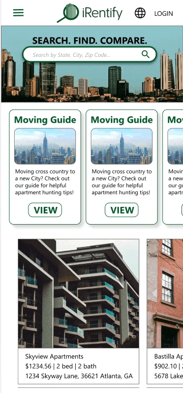
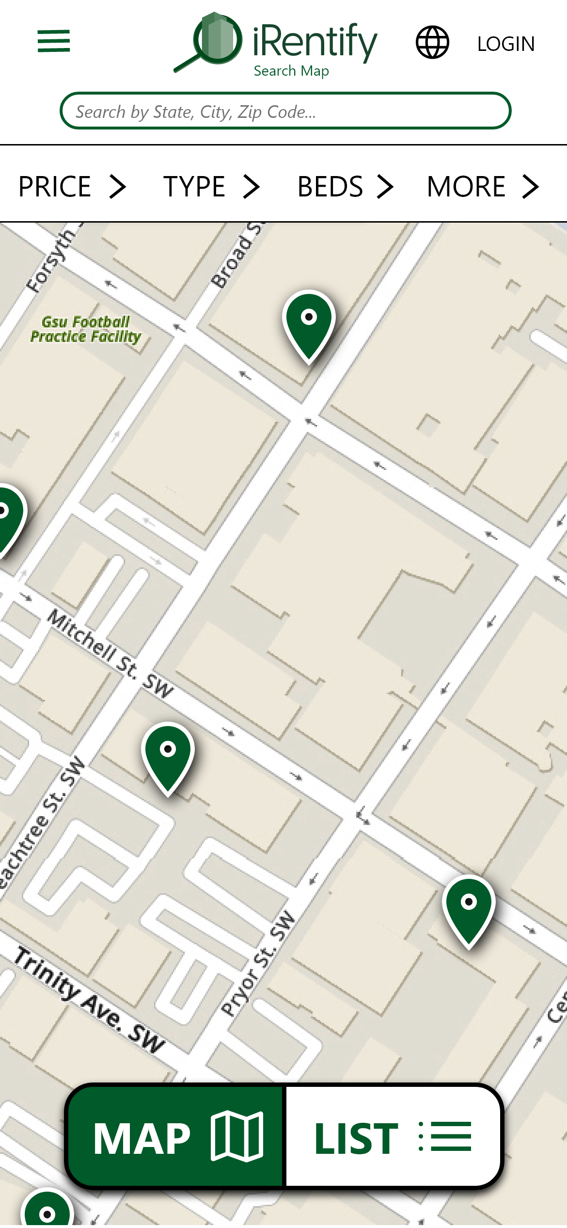
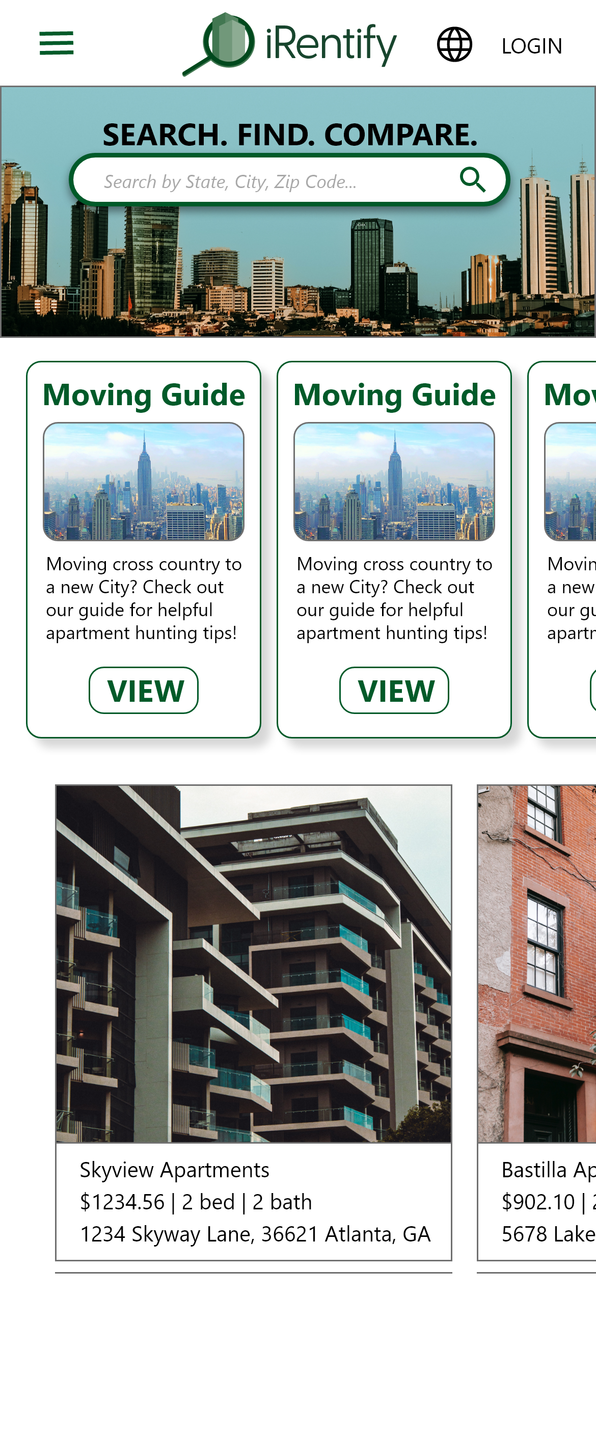
Mobile Screen Size
User Research: Summary
I wanted to get a broad overview on the apartment hunting process to better understand the user journey. My research showed that users had many pain points in the apartment process.
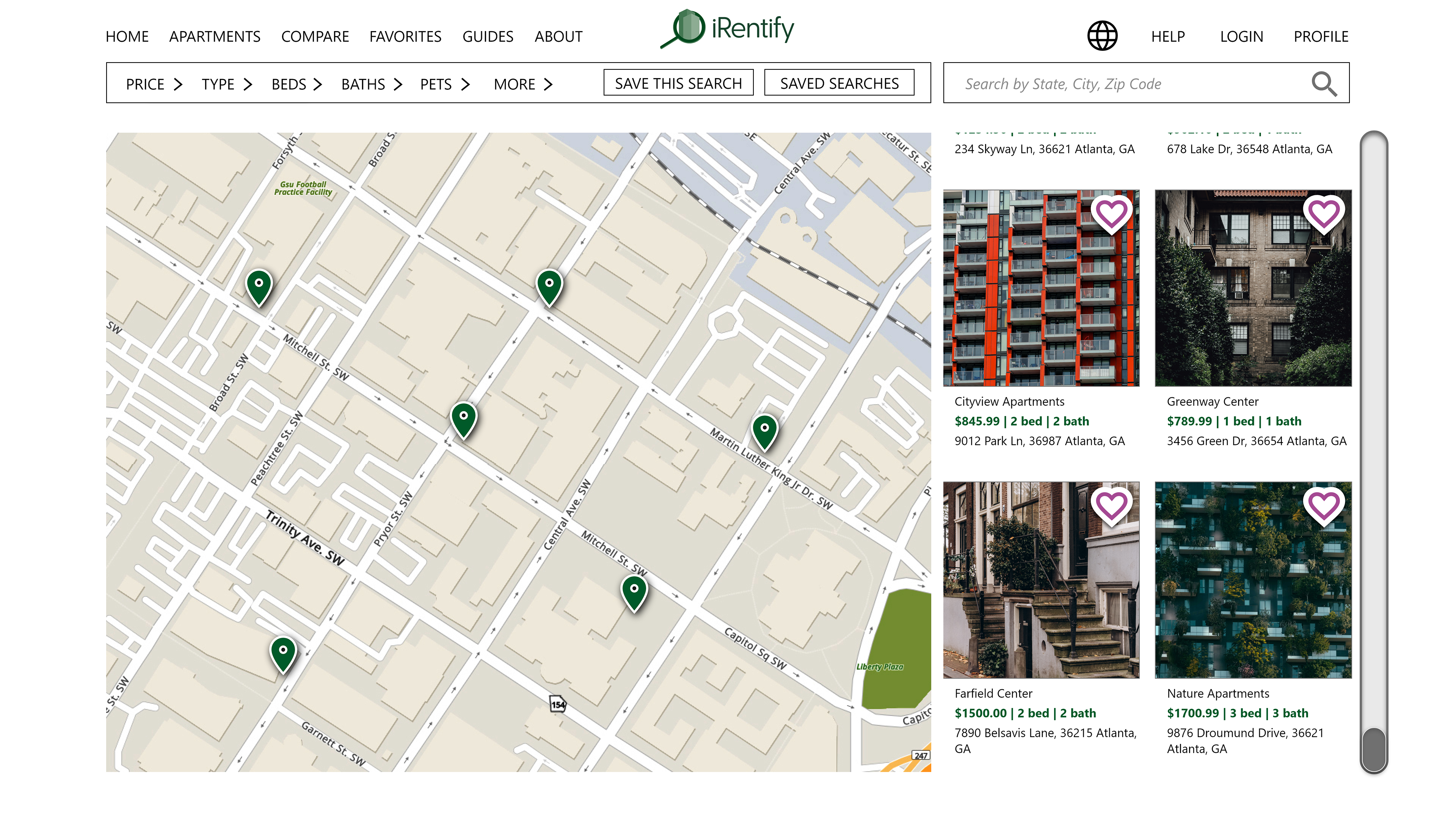
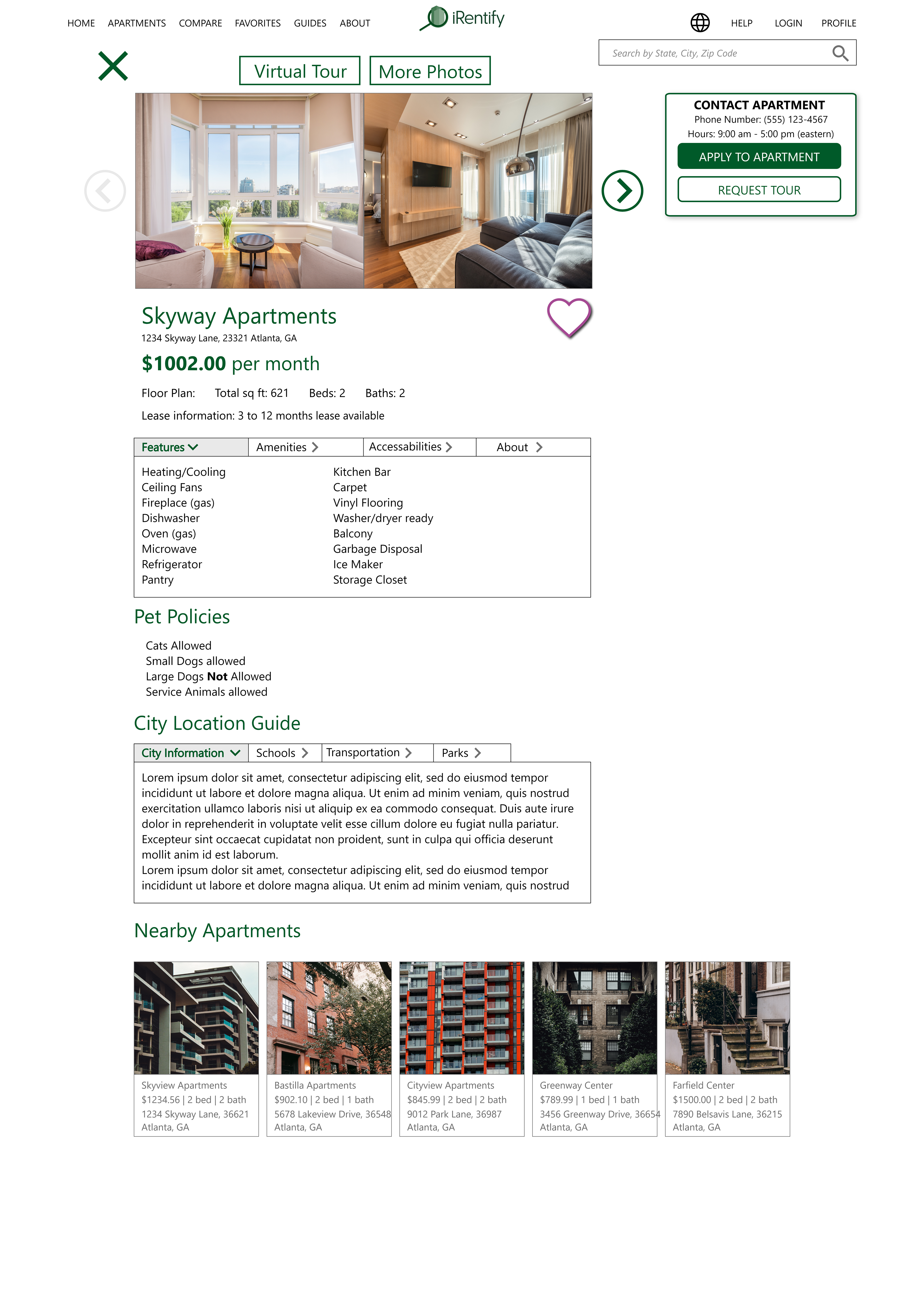
The price of the apartments was one of the biggest factors for the user’s search, but the highest factor was the specific location when it comes to the neighborhood. This research showed me the great importance of including local information surrounding each apartment by providing statistics for parks, business, school districts, crime, and services. This will greatly help the user experience and help users quickly choose the right apartment for their needs.
User Research: Pain Points
1. Time: Busy users need to search apartments on tight schedules
2. Knowledge: Users moving to new city have little to no knowledge of the area.
3. Availability: Users are in competition with others to apply for a specific apartment.
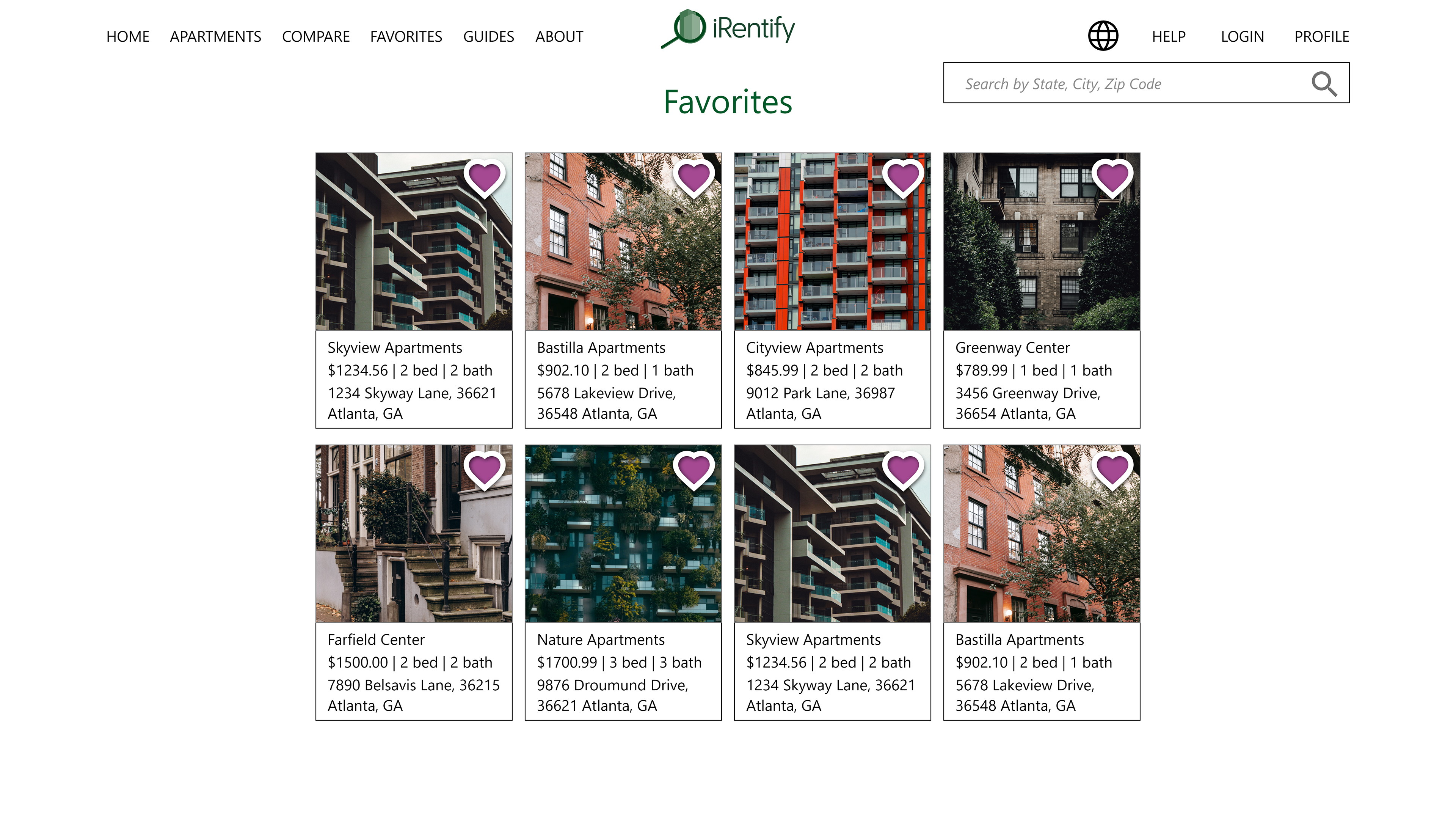
4. Comparing: Users do not have an easy way to quickly compare apartments.

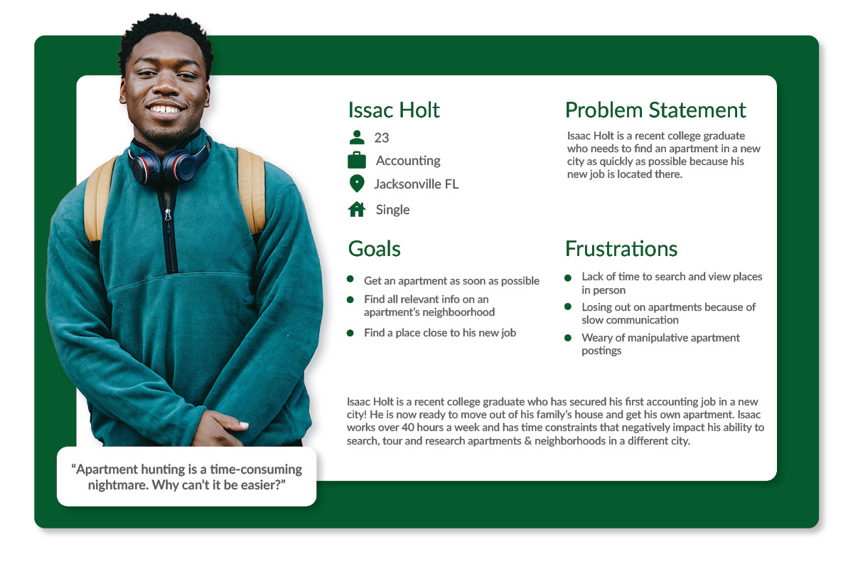
User Persona: Issac Holt
Paper Wireframes
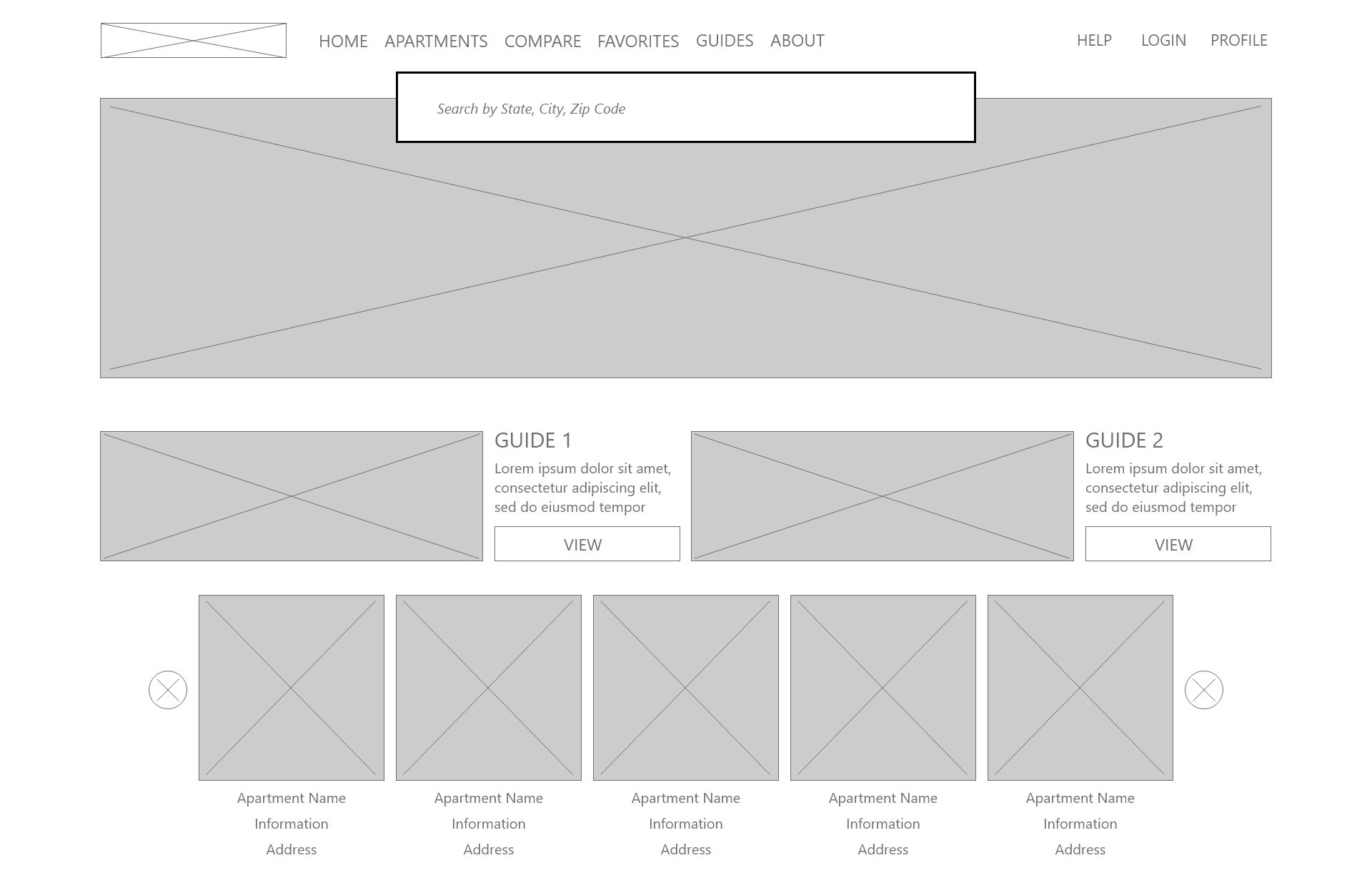
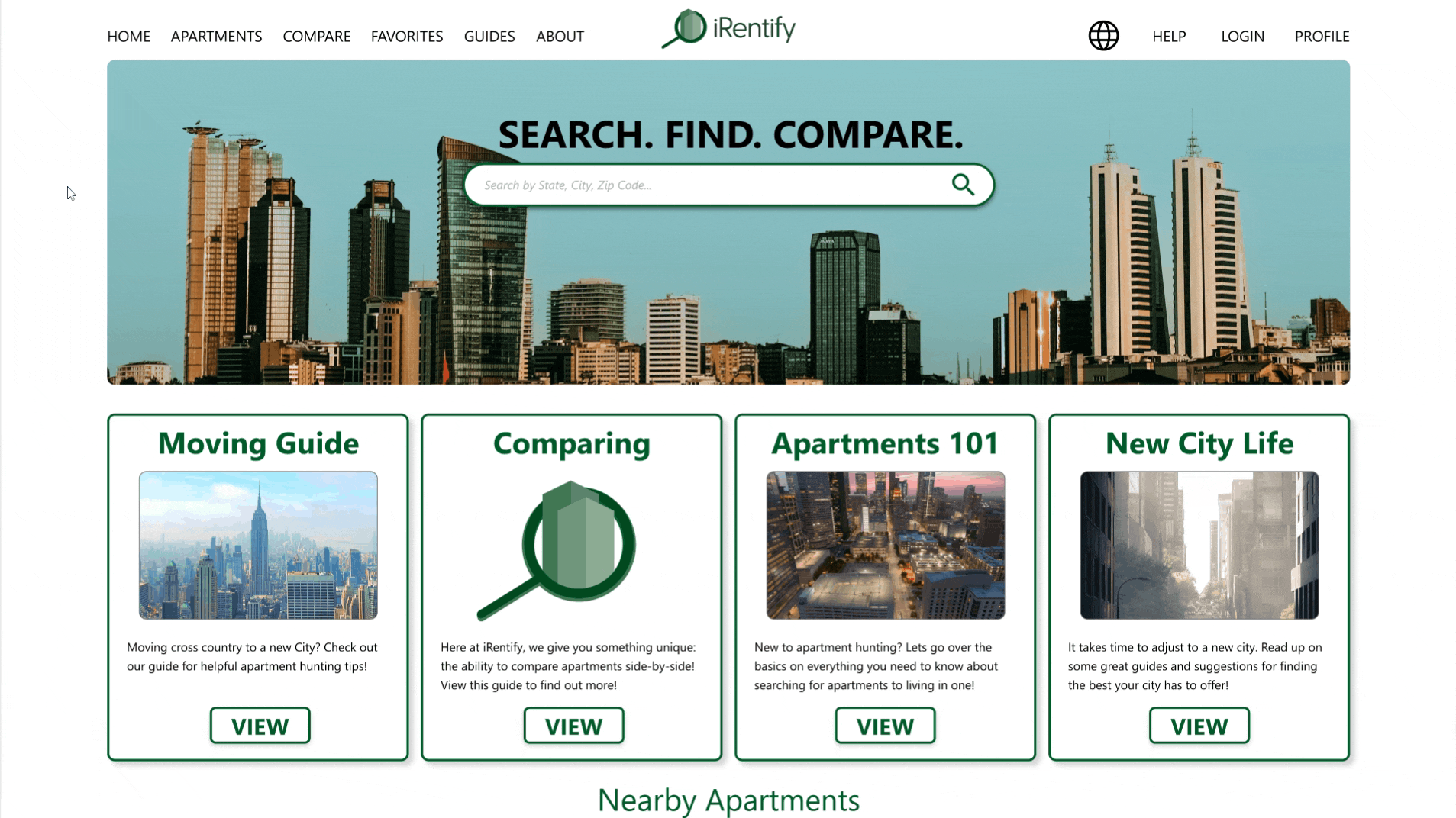
I wanted to give the homepage a large search bar for users to start the apartment search right away. I also wanted to give users informational blogs/guides and recommended apartments at the bottom of the page.
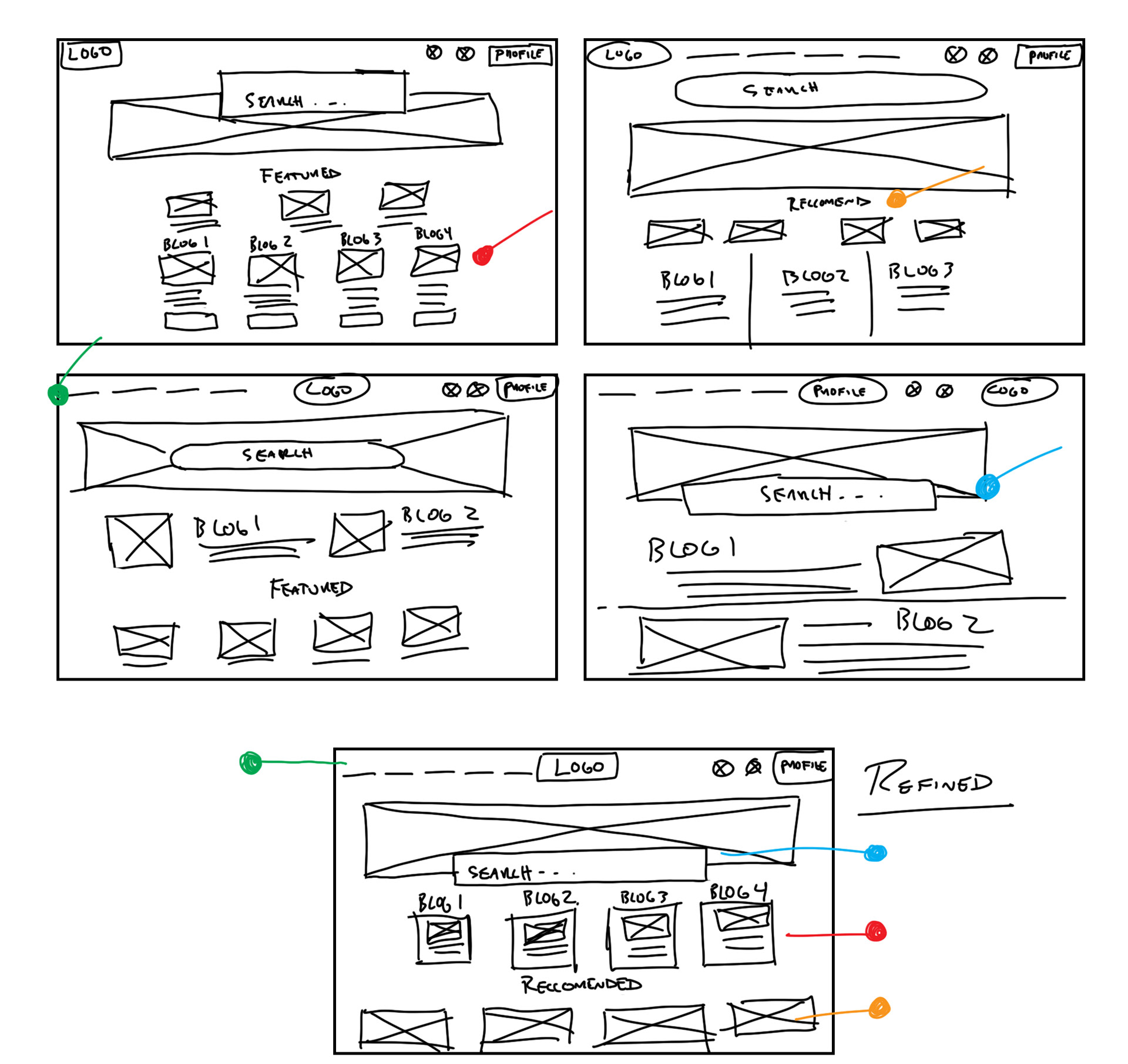
Paper wireframes for desktop and mobile
The website is designed to be responsive. Both desktop and mobile phone versions showcase how the website changes based on the size of the user’s device.
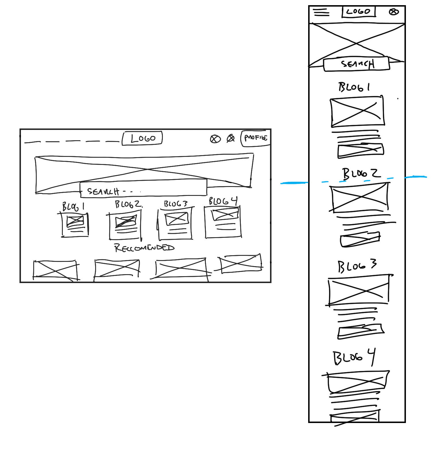
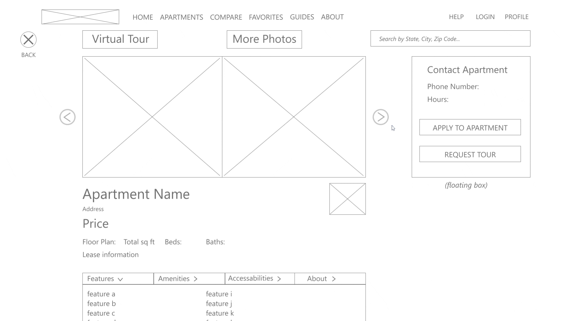
Digital Wireframes: Desktop and Mobile

Desktop
Mobile
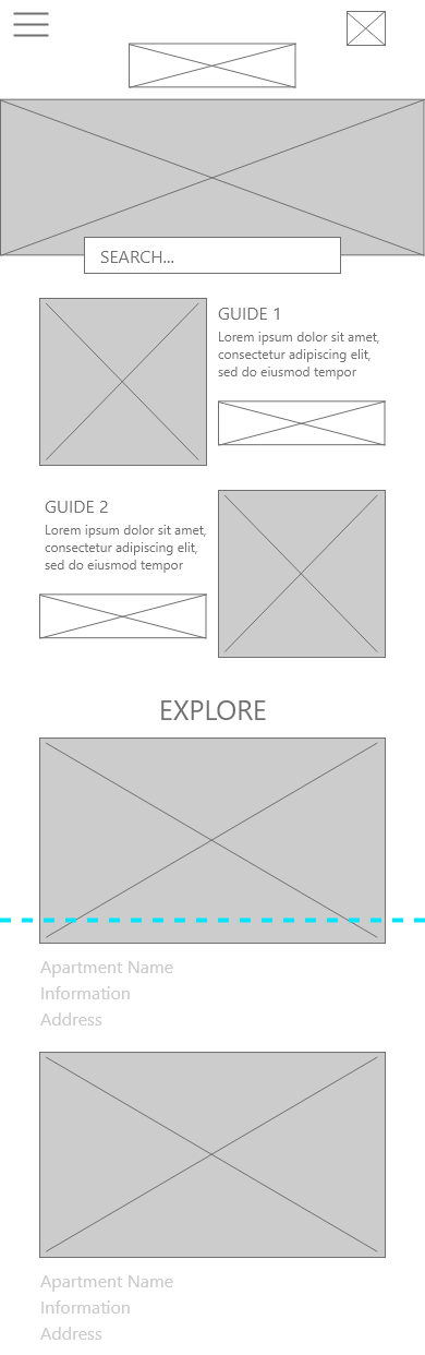
Low-Fidelity Prototype
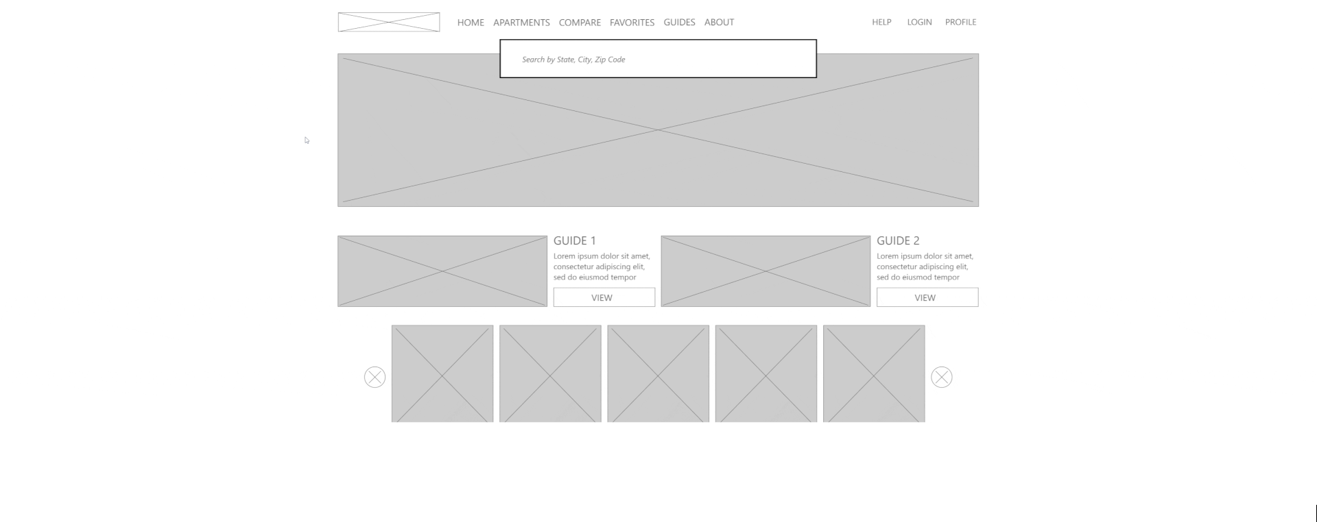
Mockups
I used the insights gained from the usability study to begin my mockups. The usability studies showed be that the homepage search bar needed to be better positioned. I moved it into the main hero image and included text to emphasis the search to users. I then moved on to clean up the apartment guides into better organized portions.
Before Usability Study
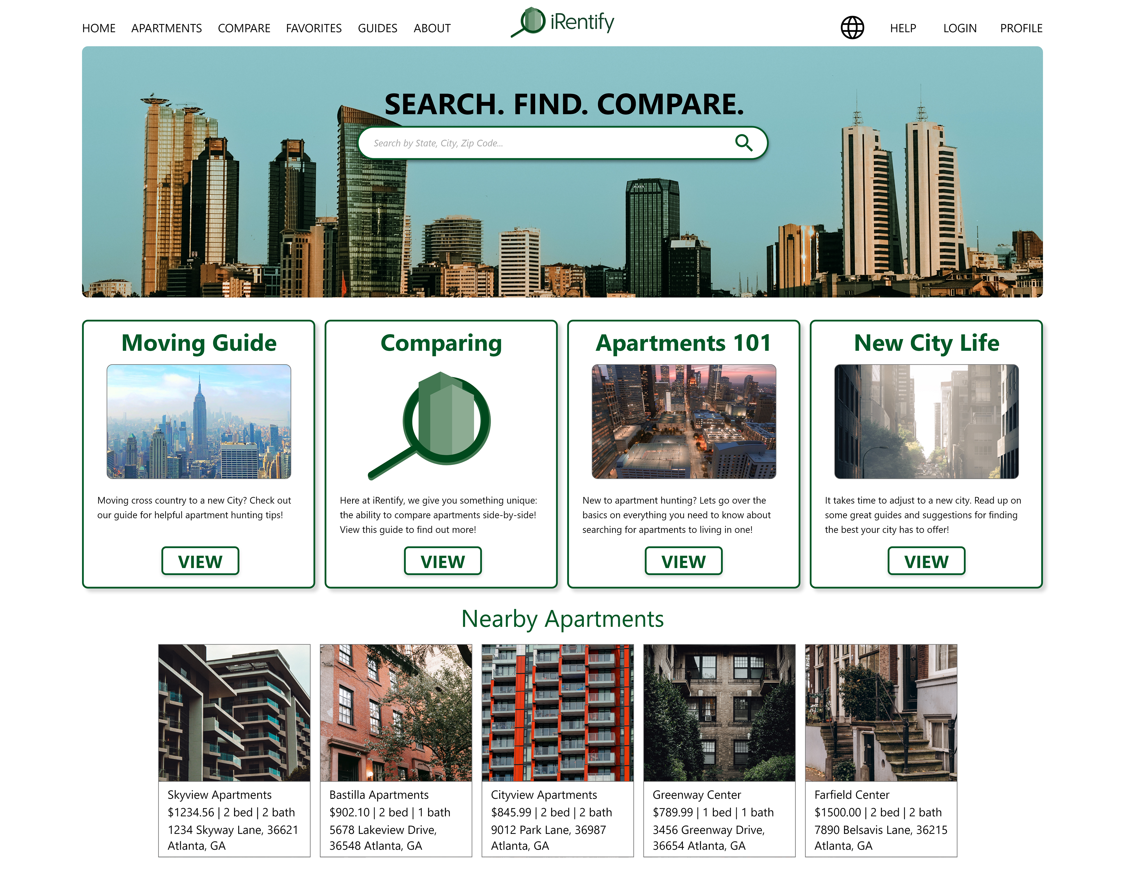
After Usability Study
Before Usability Study
After Usability Study
Mockups: Desktop Screens
Mockups: Mobile Phone Screens
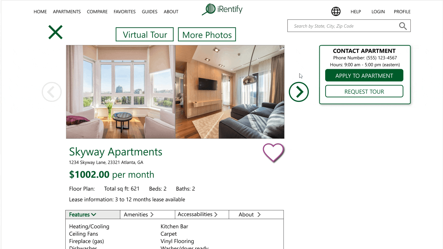
High Fidelity Prototype
Accessibility considerations
1. A language section was added to the top navigation.
2. I used icons to help users identify different portions of the website
3. Choosing the right color scheme for the app is important for contrast with users that need readers. Balancing color for the app and the company's color palette is very important.
Takeaways
Impact: The targeted users really like the interactivity that the map search brings, the ability to compare apartments side-by-side, and give a lot of information on the locations around the apartments.
What I learned:
I learned that users will always catch something you miss, be it a user flow error to not using something you thought would work out great. My takeaway is that is it fun to edit a flow or design away from what you thought worked great, to what users have made better.
Next Steps:
1. Conduct further usability studies on the desktop and mobile versions
2. Work on emphasizing the use of the compare features
3. Ideate on additional apartment details or search filters
Thank you for viewing my iRentify project!
