Note: This project has shifted from an educational learning experience to full-on app development. Throughout this project, I discovered that sports media does not have support for people with visual impairments. There is a clear market for live sports information, that would best be displayed on a convenient mobile phone, or ideally, a tablet for a user to use with a TV to see everything they have been missing.
The idea for this project came from an off-handed comment from my grandfather while watching the St. Louis Cardinals baseball game on TV. He was frustrated he couldn't read the score, inning, balls, strikes, and the sports ticket at the bottom. I talked it over with him and started "project Leroy" which them became SportVue.. This project is dedicated to him.
Project Overview
SportVue is a company that provides apps and responsive websites that provides users that have visual impairments with convenient access to sport scores and information.
The Problem:
People with visual impairments have a hard time reading text and scores on TV broadcasts and displays at sports venues.
The Goal:
Create a convenient way for users with visual impairments to be able to view sport scores and information across multiple devices and screen sizes.
My Role & Responsibilities:
Lead UX designer & UX Researcher. I was responsible for every aspect of this project, which includes user research, wireframing, prototyping, branding, logo creation and typography.
User Research: Summary
I wanted to approach user research between people at a sports event and those that are watching from home. The biggest takeaway: visual impairment accessibility is lacking in TV broadcasts and at sport venues. TV sports do not provide high contrast and large type, which leaves the visually impaired no means of seeing the score, time, and other information.
There is a clear need for a companion app/website that can be provided for these type of users.
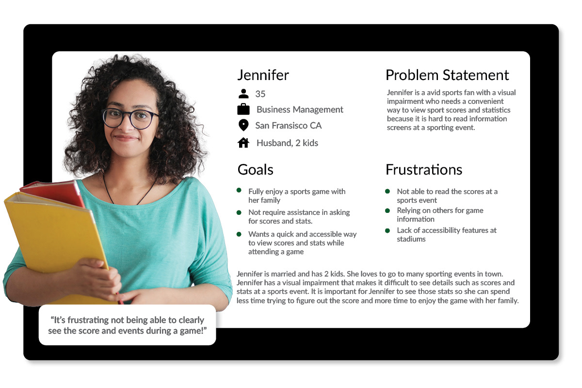
User Persona 1
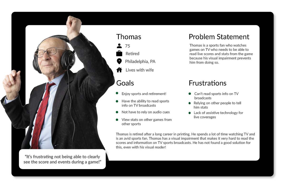
User Persona 2
Ideation
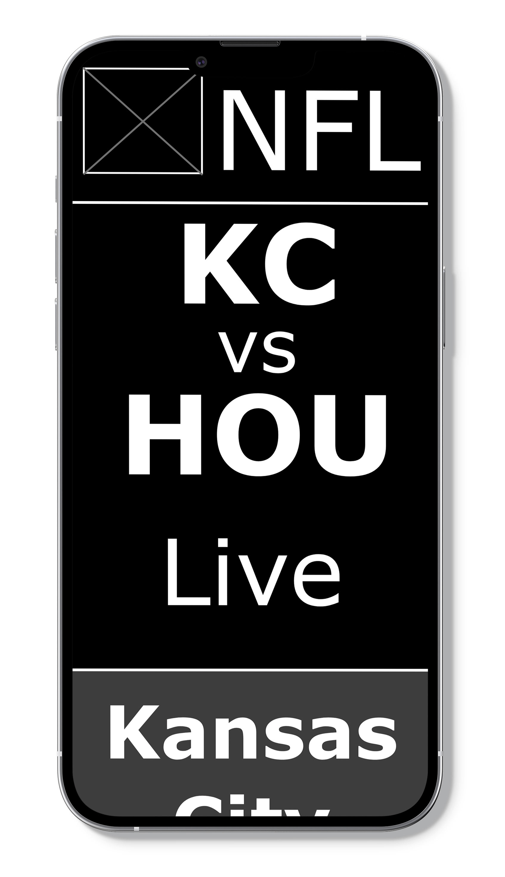
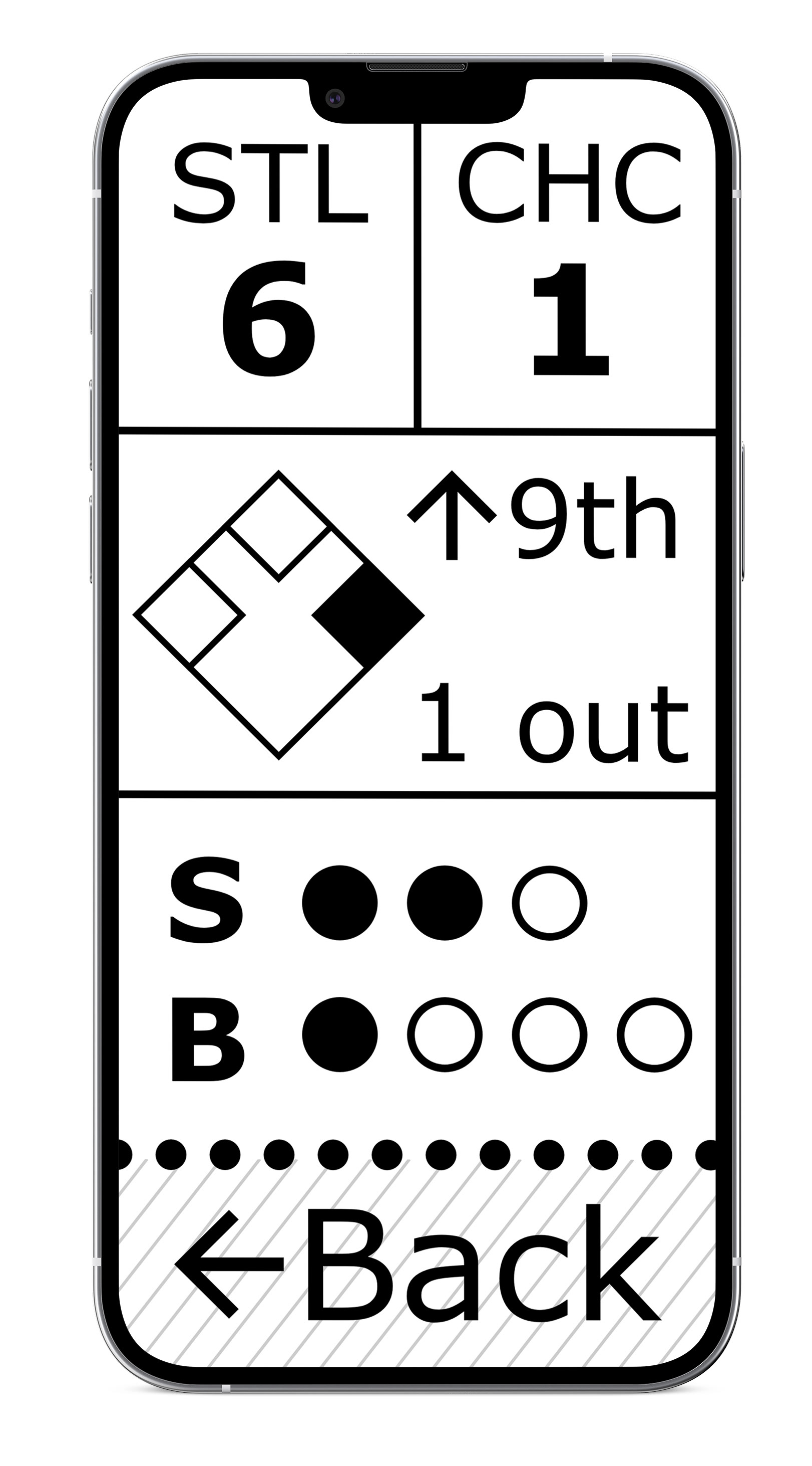
I quickly ran through the ideation exercise "crazy 8s" to explore the basic structure needed for a football game and different ways to display large text sizes. Large, high contrast text is paramount for users with visual impairments. I spent a lot of time researching visual impairments and what was and was not helpful for reading.
Crazy 8s ideation
Digital Wireframes
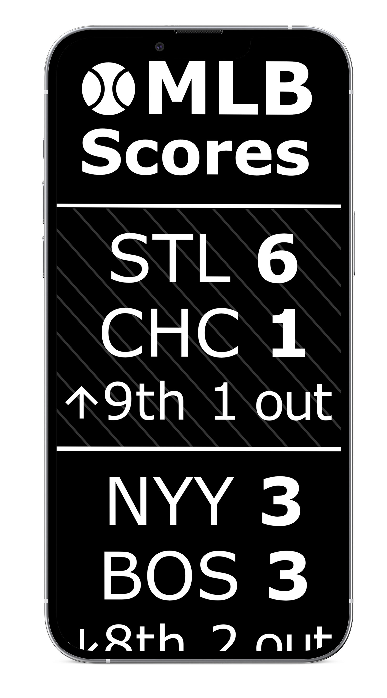
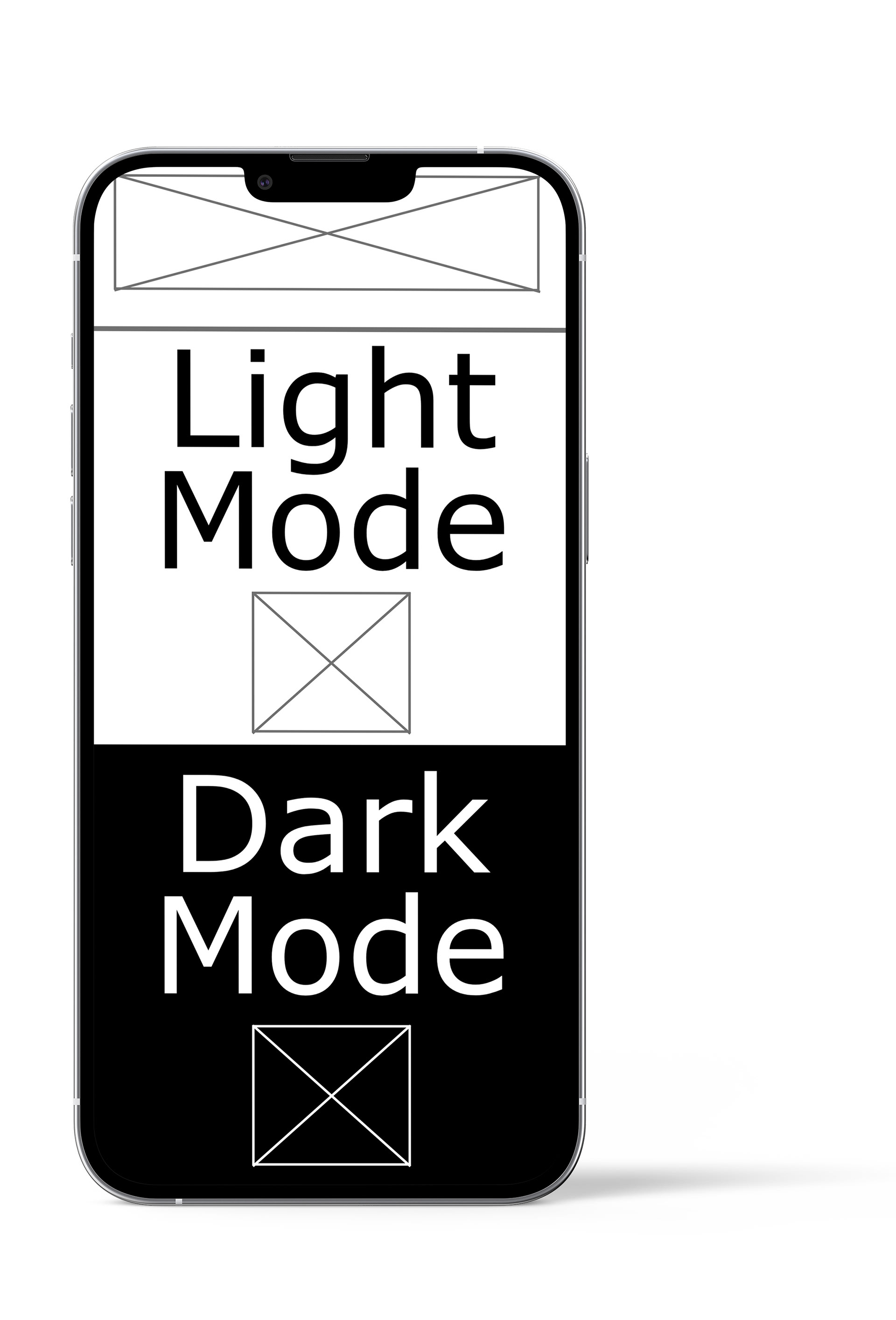
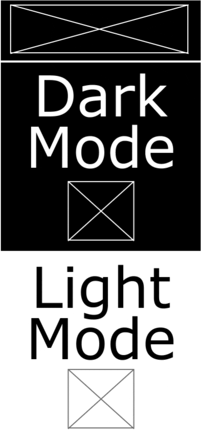
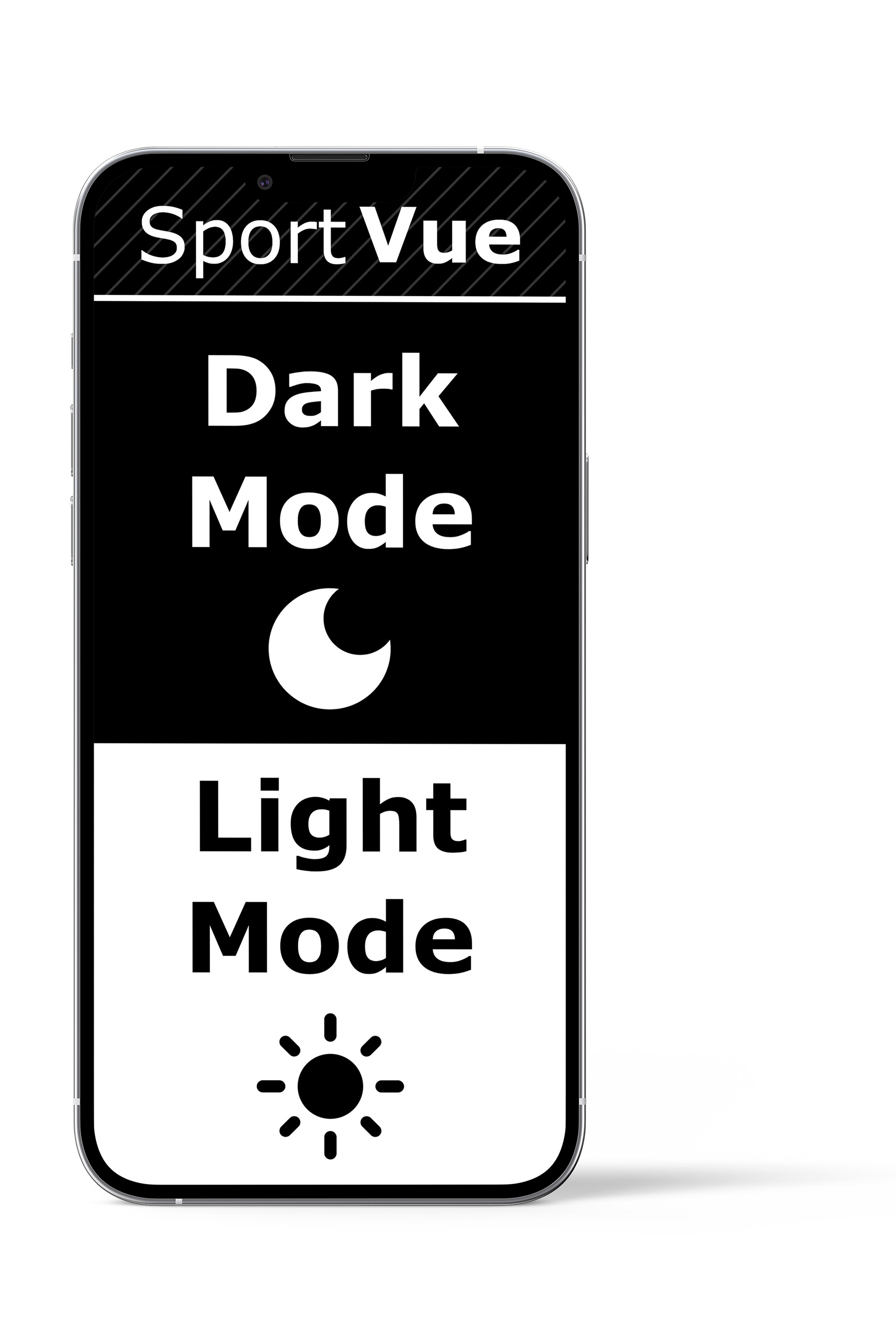
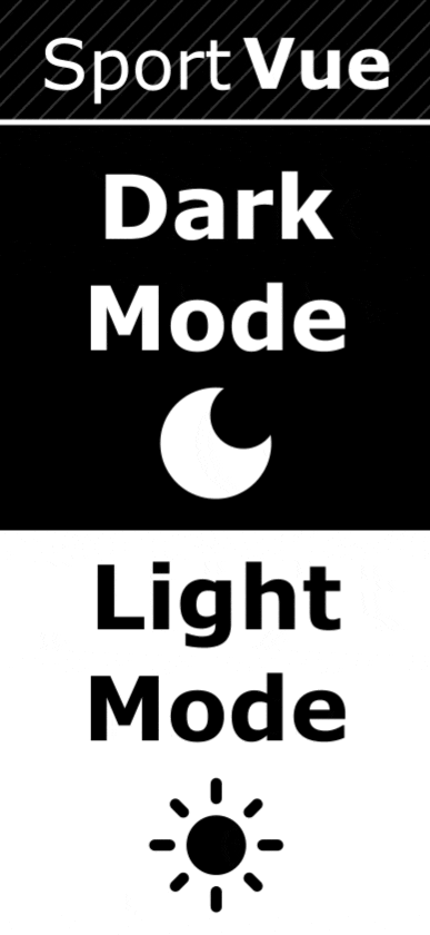
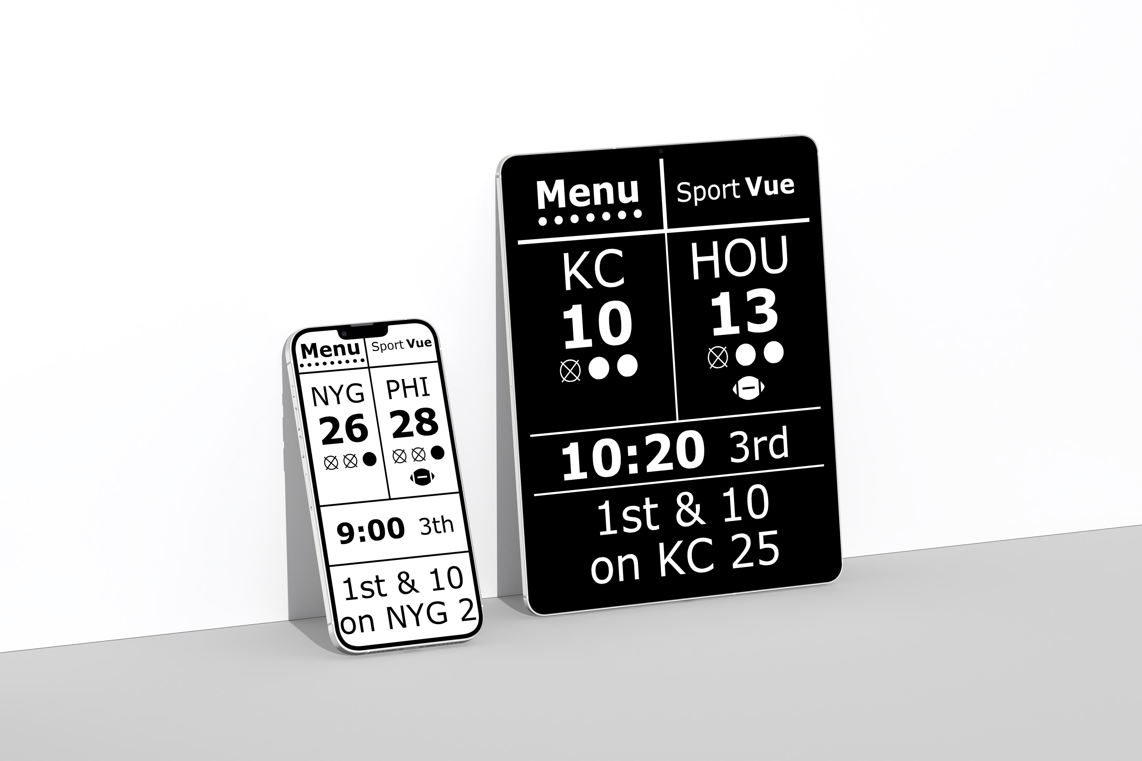
The other pillar of design that was as crucial as the text and contrast, was using a dark mode and light mode. Visual readers offer black text and white text options, so my app/website needed to do the exact same thing. Users will have the choice on which mode is easier for them to read.
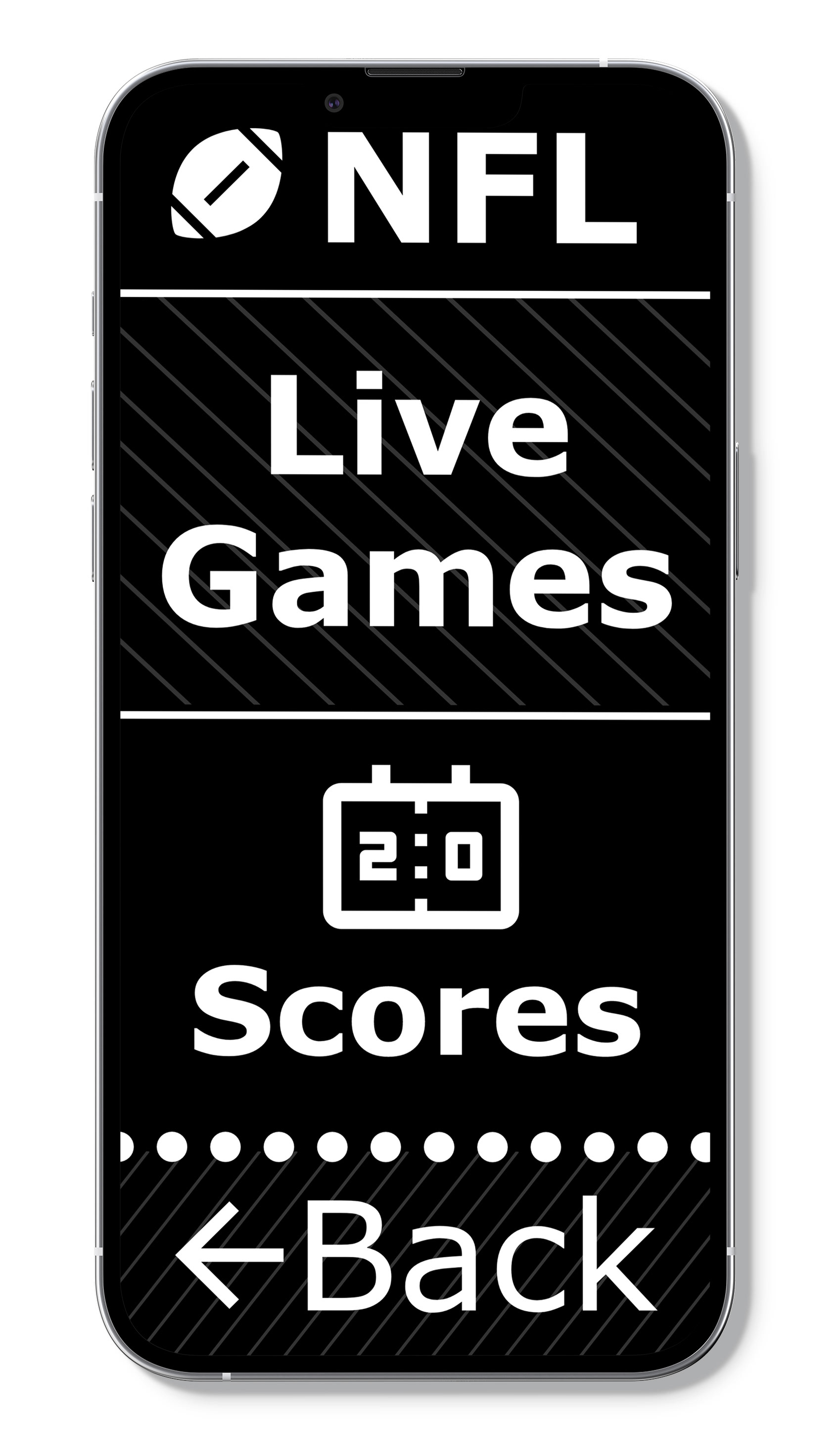
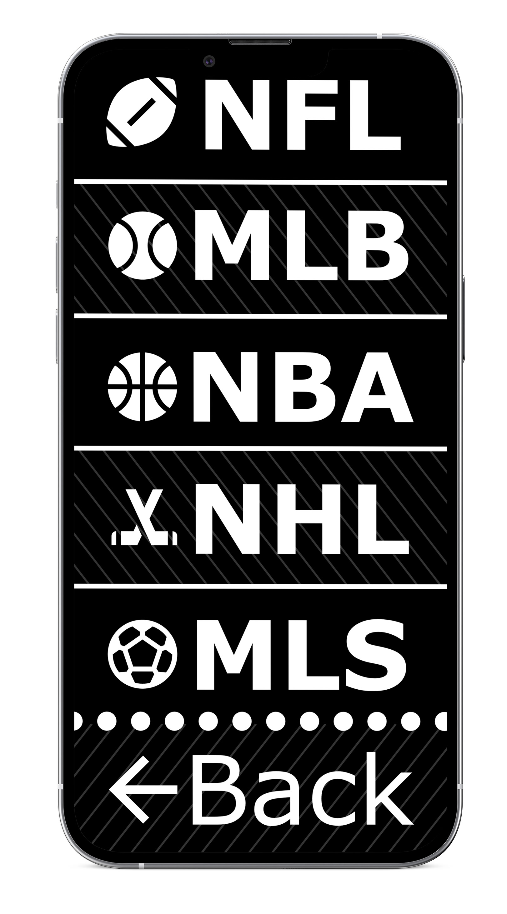
My mindset on this project was: "less is more." By necessity, this project did not need complex colors, animations, or a large navigation system. It would be counter productive for its target users with visual impairments. I design my wireframes with icon use in mind. Icons would help break-up text and provide users an alternate means to identify a section if they had problems reading the text.
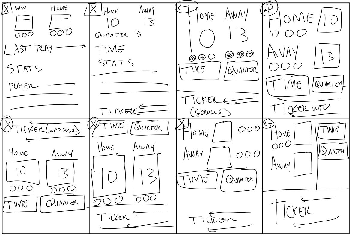
Low-Fidelity Prototype
Low-Fidelity Prototype
Usability Study
Study Type: Moderated usability study
Location: St. Louis, MO
Participants: 5 participants, 3 with visual impairments
Length: 15 minutes
Usability Study Findings:
1. All users preferred the dark mode. All users were able to read dark mode. 1 user, who had the highest visual impairment could not read light mode. I was surprised that every participant could read dark mode.
2. The news ticker, which displayed other league scores, moved too fast, for both users with and without visual impairments.
3. Timeouts were hard to properly identify for users with and without visual impairments.
After Usability Study: Mockups
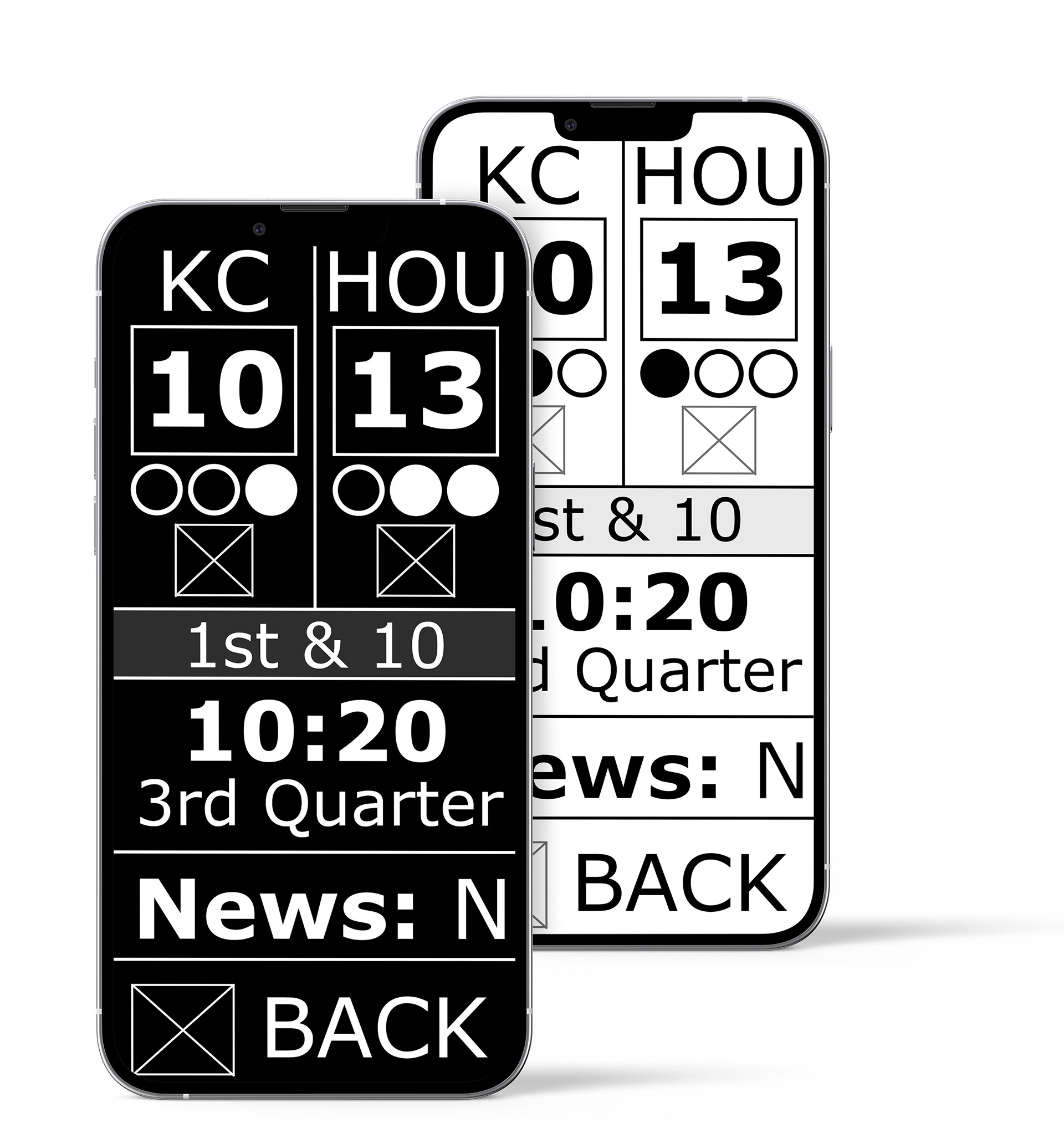
I implemented changes from insights gained from the usability study. A new section to each sport league was added for game scores. This allowed other game scores to be removed from the game page, which allowed more room for larger text sizes. I added texture to every other segment on the app design to provide a subtle visual cue for the user to differentiate between sections.
Mockups: Dark Mode Changes
The study showed all users preferred the dark mode. Dark mode was positioned at the top because it was the most readable.The SportVue logo was made with this in mind: match the logo with the easiest contrast to read.

High-Fidelity Prototype
Accessibility considerations
1. High contrast was the goal of this project: to provide the clearest text for the visually impaired.
2. Large text is also very important for the visually impaired: to read high contrast screens.
3. Icons were used to add additional means for users to identify sections of the app and to breakup text for easier reading.
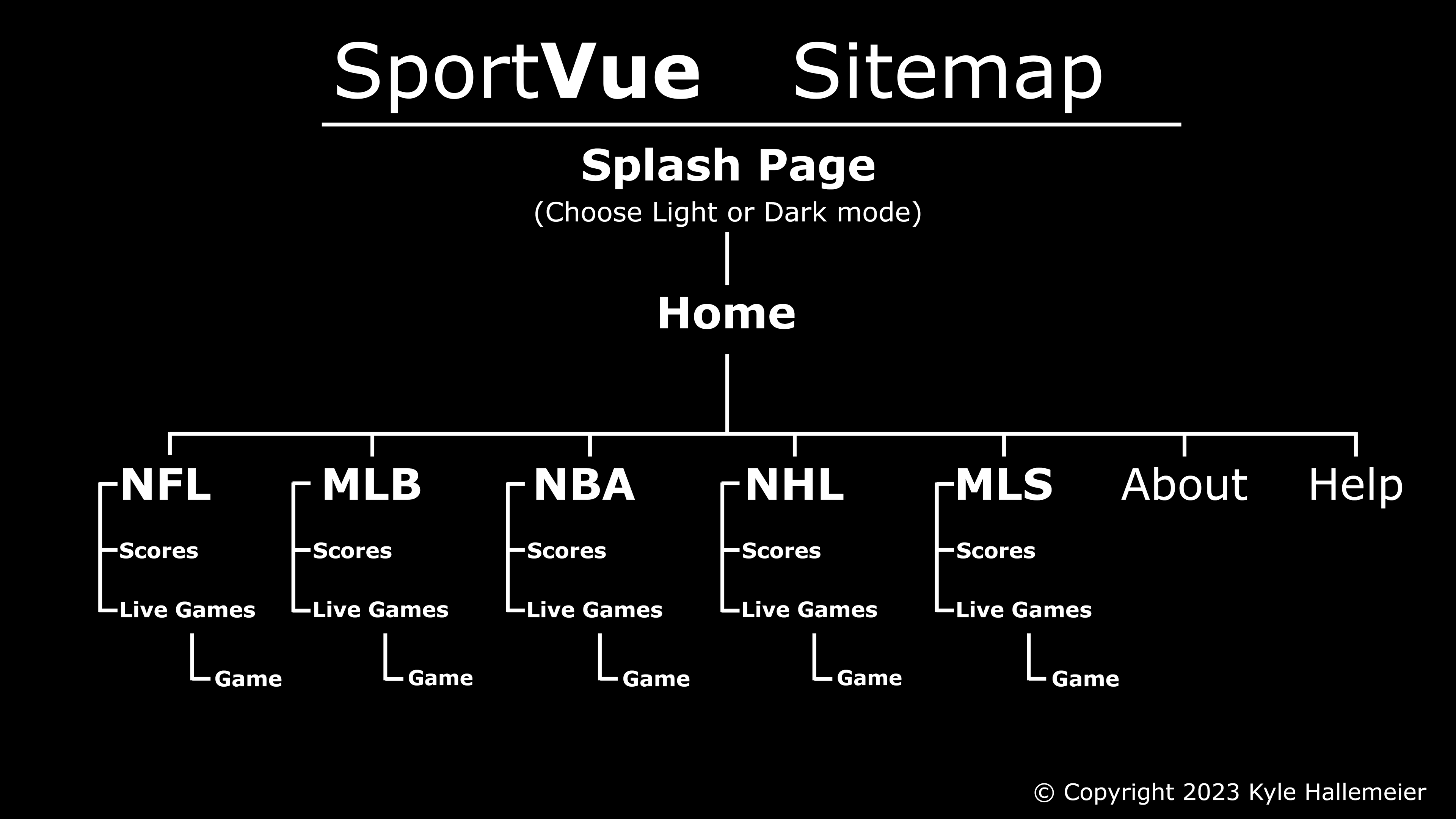
Responsive Website: Sitemap
The app was complete and now it was time to focus on the responsive website. The sitemap was created with the structure and layout of the app in mind.
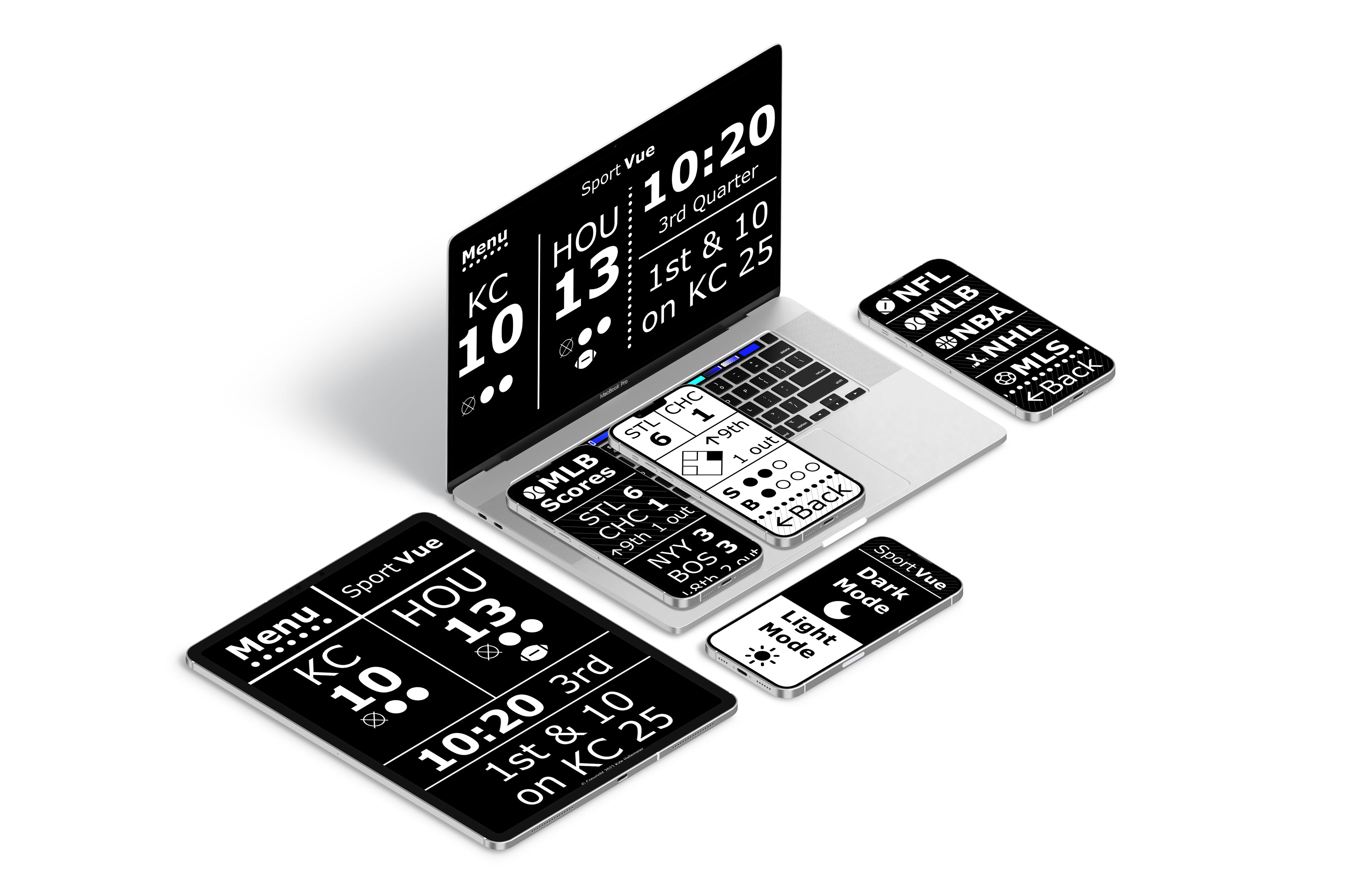
Responsive Designs
The greater the screen size, the easier it is for the visually impaired to read it. Theses devices can be used as a companion for a TV broadcast or for someone at a sporting event.
Takeaways
Impact:
Every participant in the usability study knows someone who could use this product. This has the ability to open up the visually impaired to be more immersed in their favorite sports than ever before. This project is moving forward to full-on app development, created and designed by myself, Kyle Hallemeier.
What I learned:
There is a need for more UX for the visually impaired. This project has opened my eyes to the challenges and innovations needed for designing products for the visually impaired.
Next Steps:
1. Continue the development and publishing of this project.
2. Continue testing with people with visual disabilities and start to focus on individual disabilities, such as macular degeneration.
3. Explore the use of additional fonts. There has been advancements on new fonts specifically for the visually impaired.
4. Explore options for bringing these features to TV broadcasts.
Thank you for viewing my SportVue app and responsive website! The project has turned it to so much more than expected. I am looking forward to further developing this project into real-world applications.